


MD338 Hybrid watch face
4.644.00 Reviews
App Specs
- Version
- Varies with Device
- Updated On
- License
- $1.99
- Downloads
- 10,000+
- Developer
- Matteo Dini MD ® Watch Faces
- Categories
- Personalization
- Platform
- Android
Screenshots
 Analysis by AppCompare
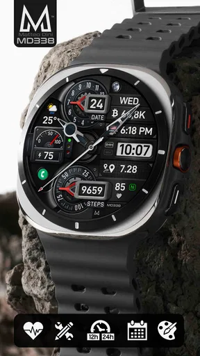
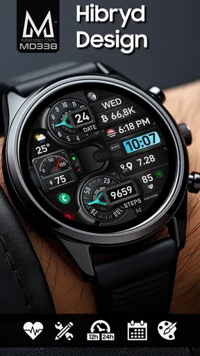
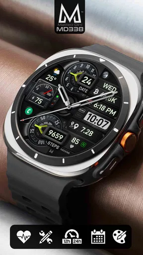
I spent time with MD338 Hybrid as a practical Wear OS personalization app rather than treating it as a decorative download. Its appeal is easy to understand: it combines an analog-style dial with digital information, then gives you room to adjust the appearance for daily use. I found that balance more useful than a purely visual watch face, especially when I wanted to glance at the time quickly but still keep the watch looking traditional.
Created by Matteo Dini MD ® Watch Faces, this paid watch face costs $1.99 and is listed for Everyone. It sits in the personalization category, has reached over 10K installs, and holds a 4.6 average from 498 ratings and 44 reviews. Those figures suggest a small but established audience, although I would still judge it mainly by how comfortably its layout works on your own Wear OS watch.
How the hybrid layout handles readability and navigation
The central idea is the combination of hands and digital information. That matters because analog hands can be pleasant to read at a glance, while digital elements are often easier when I need an exact time or another piece of information without interpreting the dial. MD338 Hybrid is strongest when you want both approaches available instead of committing completely to one.
In ordinary use, I could look at the hands for a quick sense of the hour and minute, then use the digital portions when I needed more precision. This two-step reading style is useful in situations where I do not want to stare at the screen. It also gives the face a more familiar clock-like character than a screen filled entirely with small digital fields.
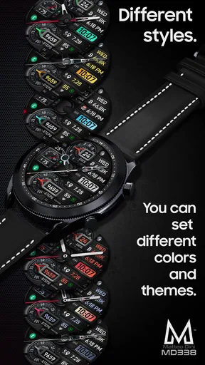
The customization is the main reason to spend time setting it up. A highly adjustable face can be made calmer or denser depending on what you actually need. I would begin with the information I check most often, then remove anything that competes with the time. That approach is particularly important for users with reduced visual attention or anyone who becomes overwhelmed by crowded displays.
My practical recommendation is to test the face in the exact light where you normally use your watch. A design that looks clear indoors may feel busier outdoors, and a color combination that seems attractive in the setup screen may not be the easiest to scan while walking. I would also avoid placing secondary information near the hands if your chosen arrangement makes them overlap frequently.
Navigation is not about moving through a complicated app interface every day; it is about how quickly the eye can find the time and any supporting information. MD338 Hybrid works best when you treat customization as an accessibility decision, not merely a style exercise. Fewer elements, stronger contrast, and a predictable arrangement can make the face feel much easier than a more elaborate configuration.
Worth Reading Before You Choose

EA SPORTS FC Mobile 26 Is a Bigger Football Game, but It Takes Time

Flipboard Shows What News Apps Must Do Beyond the Feed

Switching to Android Auto Means Rethinking Your Driving Routine

Google Calendar Makes a Crowded Week Easier to Manage

Ludo King Makes the Most of the Minutes Between Plans

Baby Panda World Brings Quick Play to Modern Phones, but Its Game Library Feels Busy
Why the analog-digital combination helps
Different people read clocks in different ways. Some users recognize the position of the hands instantly, while others prefer numerals because they remove interpretation. A hybrid face gives both groups a useful starting point. I could use the analog portion for a quick glance and rely on the digital portion when precision mattered.
There is also a situational advantage. If I am checking the watch while distracted, the hands provide a broad impression of the time. If I am timing a meeting or deciding whether I have enough time to leave, the digital reading is more direct. That flexibility makes the face feel more practical than a design that prioritizes one reading method exclusively.
The trade-off is visual density. Combining two time systems and additional customizable elements can create competition on a small screen. I would not assume that every available field belongs on the final layout. The best result comes from deciding what deserves immediate attention and what can be left out.
Making the display easier to scan
I found that a good setup depends less on adding information and more on creating a clear hierarchy. The time should remain the first thing I notice. Secondary details should support it rather than force me to search around the dial. If you use the face for appointments, activity checks, or another repeated task, place that information where your eyes naturally land instead of scattering it across the screen.
For users who need larger visual targets, the analog hands may be more comfortable than tiny text, but that depends on the selected arrangement and the watch itself. Screen size, resolution, brightness, and the wearer’s eyesight all change the result. I would spend a few minutes checking the face from a normal wrist position instead of judging it with the watch held close to my eyes.
Another useful habit is to create a simple everyday configuration before experimenting with decorative choices. Once the essential time display feels reliable, you can add visual detail carefully. This prevents the common problem of ending up with an attractive face that becomes tiring to read.
Motor, sensory, and situational considerations
A watch face cannot remove every interaction barrier, but MD338 Hybrid can reduce some of them through a thoughtful arrangement. If tapping small controls is difficult, the benefit of doing most customization before regular use becomes clear. Once the face is configured, the main task is usually glancing at the display rather than repeatedly navigating menus.
That makes it potentially comfortable for people who prefer limited interaction, have reduced dexterity, or do not want to perform several gestures just to understand the time. Still, I would not describe it as a dedicated accessibility tool. Its suitability depends on how the chosen design appears on a particular watch and whether the wearer can distinguish the selected elements comfortably.
For sensory differences, restraint is valuable. A face with too many competing colors or information blocks can be distracting, especially during a busy day. I would favor a stable, low-clutter arrangement if visual noise bothers you. The ability to personalize the face gives you a chance to avoid unnecessary stimulation, but it also creates the temptation to keep adjusting until the display becomes overloaded.
People with color-vision differences should be cautious about relying on color alone to separate information. I would look for differences in position, shape, size, or the contrast between the hands and background. Since watch displays vary, the safest approach is to check the finished face under several lighting conditions and ask someone else whether the important elements remain easy to identify.
For users with hearing loss, the visual nature of a watch face is naturally useful when the goal is simply checking time without depending on an audible cue. On the other hand, the face itself does not replace every other form of notification or communication. I see it as a clear visual surface, not a complete solution for every accessibility need.
Everyday scenarios where the design makes sense
Imagine leaving work while carrying a bag and walking toward a bus stop. You may not want to stop and operate the watch. A glance at the hands can tell you whether you are early or late, while the digital reading can give you a more exact answer. That is the kind of small, repeated moment where this design feels more useful than a purely ornamental watch face.
At home, I could also see it working well for someone who checks the time from different distances. The analog structure is recognizable from a quick look, while the digital information helps when the watch is closer. This is not a promise that every wearer will find it equally readable, but the two-format approach gives you more than one way to interpret the screen.
During a meeting, a restrained configuration can be less disruptive than opening a phone. The watch remains a glanceable object, and the traditional clock appearance may feel less visually aggressive than a bright, information-heavy design. I would still keep the layout simple in professional settings, because extra fields can make the face look busier than necessary.
For exercise or outdoor use, the answer is more conditional. A highly customizable face may let you prioritize the information you care about, but readability can change with movement, glare, and attention. If you need a purpose-built sports display with large, specialized controls, another watch face or the watch’s native fitness screen may be a better choice.
Where it compares well with usual alternatives
The usual alternatives are a basic digital face, a minimalist analog face, or a heavily themed design. A basic digital option may be faster for people who want only the exact time and dislike visual interpretation. A minimalist analog face may be calmer, but it can provide less information. A themed face may look distinctive, yet often sacrifices the everyday neutrality that makes MD338 Hybrid easy to wear with different clothing and routines.
What I like here is the middle ground. It does not force me to choose between a classic dial and digital convenience. It is also more adaptable than a fixed design because I can shape the presentation around my own priorities. The cost is that setup requires judgment. Someone who wants to install a face and never think about layout may prefer a simpler alternative.
The price is modest for a paid personalization app, but value depends on how often you change watch faces and how much you care about customization. If your current free face already gives you a clear time display and the information you need, MD338 Hybrid may not feel essential. If you want a reusable everyday design that can be adjusted instead of replaced whenever your preferences change, the purchase is easier to justify.
Remaining barriers before you choose it
The biggest barrier is the small display itself. No amount of customization can make every detail equally comfortable on every Wear OS watch. Users who need very large text, extremely simple layouts, or strong separation between all elements should approach it carefully and be prepared to remove secondary information.
Another barrier is decision fatigue. A flexible design can be empowering, but it can also take time to configure. I would not recommend it to someone who finds customization frustrating or who wants a completely finished result immediately. The face rewards experimentation, yet the best configuration may require trying it during real routines rather than selecting options once and forgetting them.
There is also a difference between visual accessibility and interaction accessibility. A readable face helps with glances, but it does not guarantee that every setting or control will be easy to operate. If precise tapping, small interface targets, or multi-step setup are difficult for you, it is worth considering whether someone can assist with the initial configuration.
Battery expectations are another reason to stay realistic. A watch face that presents more information may encourage more frequent checking, and any active display design has to be judged alongside your watch’s own behavior. I would not buy this face solely for maximum battery efficiency. I would choose it for the balance between appearance, information, and personal control.
Finally, people who strongly prefer a single reading method may find the hybrid concept unnecessary. If digital numerals are always clearer to you, a dedicated digital face could be less distracting. If you want an uncluttered traditional dial, a simpler analog design may offer a more comfortable experience. MD338 Hybrid is most convincing for users who genuinely benefit from having both formats available.
My inclusive verdict
I see MD338 Hybrid as a flexible everyday watch face with a useful accessibility angle, provided you treat its customization as part of the setup rather than an optional decoration. The analog-digital pairing supports different ways of reading time, and a careful arrangement can make the display calmer, more predictable, and easier to scan in ordinary situations.
It is a good fit for someone who wants a traditional-looking Wear OS face but does not want to give up digital information. It also suits users who are willing to adjust contrast, spacing, and information density around their own needs. The design can support different abilities and contexts, but the result depends on the watch, the selected configuration, and the wearer’s vision and interaction preferences.
I would skip it if you need a specialized accessibility interface, a sports-focused screen, or a completely minimal face that requires no setup. I would also think twice if small text and dense layouts are consistently uncomfortable for you, because customization cannot guarantee that every element will become easy to read.
For me, the strongest reason to recommend it is not simply that it looks polished. It is that the hybrid format gives you two familiar ways to understand the time, while the adjustable presentation lets you decide how much information deserves space. At $1.99, that flexibility makes sense for a Wear OS user who wants one adaptable daily face rather than a collection of narrowly focused designs.
My final advice is to start with the clearest possible arrangement, use it during your normal day, and only then add extra details. If the face remains comfortable in bright light, dim rooms, movement, and quick glances, it is doing its job. In that situation, MD338 Hybrid becomes more than a stylish personalization choice: it becomes a watch face shaped around the way you actually read and use your watch.
Pros
- Clean hybrid layout combines analog hands with easy-to-read digital data.
- Useful at-a-glance information such as date
- battery
- and weather details.
- Multiple color and display options allow quick personalization.
- Designed for low power use on compatible Wear OS watches.
- Compact information layout remains practical during workouts or daily use.
Cons
- Some features may require companion apps or additional permissions.
- Small text can be difficult to read on watches with compact screens.
- Customization options may vary depending on the Wear OS version.
- Weather information can be unavailable without a connected phone or data link.
- The detailed design may feel busy compared with minimalist watch faces.
FAQs for MD338 Hybrid watch face
What is MD338 Hybrid watch face?
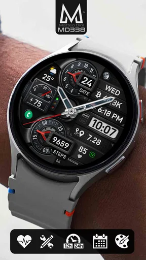
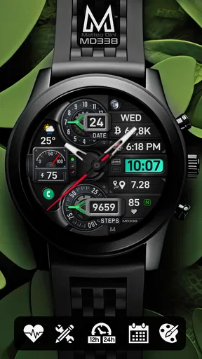
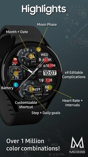
MD338 Hybrid is a customizable watch face designed for compatible Wear OS smartwatches. It combines an analog-style clock with digital information, giving the display a traditional appearance while still showing useful data at a glance. Depending on the supported configuration, you can typically view elements such as the date, battery level, steps, weather, and other shortcuts directly from the main screen.
Which smartwatches are compatible with MD338 Hybrid?
Before downloading, check the compatibility information on the Google Play listing because support can vary by device and Wear OS version. MD338 Hybrid is intended for Wear OS watches rather than older platforms such as Samsung Tizen or basic fitness trackers. Some features may also depend on the watch model, installed sensors, permissions, and whether the face is being used on a round or square display.
Can I customize the MD338 Hybrid watch face?
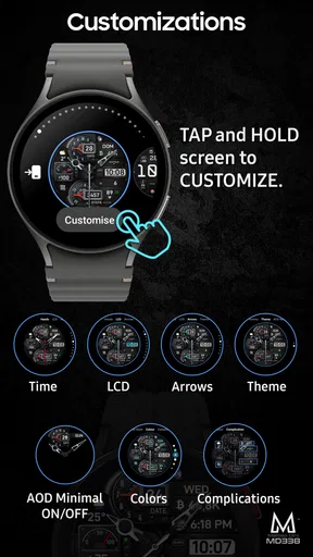
Customization is one of the main reasons to choose MD338 Hybrid. After installation, users can usually adjust available colors, styles, complications, and information fields through the watch face settings or the Wear OS companion interface. The exact options may differ according to the edition and device. It is worth exploring the configuration menu carefully, since some shortcuts or data panels may be optional rather than visible by default.
Does MD338 Hybrid affect battery life?
Like any active watch face, MD338 Hybrid uses a small amount of additional battery power, although the actual impact depends on your watch, brightness, complications, and update frequency. Animated elements, frequently refreshed weather information, and constant sensor data can consume more energy. If battery life becomes a concern, reduce unnecessary complications, use a simpler color scheme, and review the ambient or always-on display settings.
How do I install and use MD338 Hybrid on my smartwatch?
Install MD338 Hybrid through the official Google Play Store listing while signed in with the account connected to your compatible Wear OS watch. Once installation is complete, open the watch face selector and choose MD338 Hybrid, then configure its appearance and complications. If it does not appear immediately, allow a few minutes for synchronization, confirm that the watch is connected, and restart the companion app or watch if necessary.


